Printable Version of Topic
Click here to view this topic in its original format
HTMLHelp Forums _ Markup (HTML, XHTML, XML) _ Responsive and adaptive design
Posted by: Lee Batchelor Jan 12 2024, 01:12 PM
Hi all,
When I was trained in HTML and CSS, it was when desktop computers were the only platforms. Now that mobile devices are used for 51% of all web browsing, we need to use responsive and adaptive design so that the website resolves correctly on all devices. I recently completed a web design and used this code in the meta tags,
<meta name="viewport" content="width=device-width, initial-scale=1">
Sadly, this doesn't cause the website to resolve correctly on mobile devices in landscape and portrait modes. I have a feeling there's a 500 hour course of instruction in my future if I want to fix this issue. Perhaps there are some easier lines of code that will solve my problem? Thoughts?
Thanks...
Posted by: coothead Jan 12 2024, 02:42 PM

Thoughts?
If your page appears to be unresponsive, disable your CSS
and you will find that it actually becomes responsive.
So you will then know where the problem lies.
If you cannot resolve it give the members here your HTML
and CSS code and they might be able to help.

coothead
Posted by: Lee Batchelor Jan 12 2024, 03:32 PM
Thanks Coothead. If I disable my entire CSS sheet, the pages will be a jumbled mess. How will I know if the result is reliable? I assume you mean, "Yes, things will be messed up but the messed up pages will look the same on my iPad, Android, cell phone, and other devices as my PC."
Do I have this right?
Posted by: coothead Jan 12 2024, 04:33 PM
Do I have this right?
Not really.
Your page will be responsive when the page is rendered without
horizontal scrolling on all devises.
HTML alone does this.
CSS can mess it up.
Check out items 3 - 4 on this page...
https://www.coothead.co.uk/make-a-web-page.html

coothead
Posted by: Christian J Jan 12 2024, 05:27 PM
If I disable my entire CSS sheet, the pages will be a jumbled mess.
That shouldn't be the case with a good HTML structure. A link to a sample page might help.
Not sure what you mean with "the same" here, but one of the strenghts of web pages is that they can (and should) adapt to different media.
Posted by: Lee Batchelor Jan 12 2024, 10:20 PM
Thanks, Coothead. I'll give that article a read.
Posted by: Lee Batchelor Jan 12 2024, 10:34 PM
Christian, I nulled out the CSS sheet and opened the index.htm page on my PC. Everything displayed perfectly but the alignments were all to the left. I can upload the page to the server and test it on various mobile devices to discover how and if my CSS structure is causing issues.
As a matter of history, I studied technical writing for two years and obtained my diploma, about 12 years ago. Two of my courses were HTML and CSS but that was long before mobile devices became the norm. Over the years, I have basically self-taught myself, so a modern-day, formally trained web developer may look at my coding and tell me to go back to school! The only code proofing tool I use is the W3C validator. I'm happy to post the code to my index.htm page and CSS sheet. There is nothing proprietary or private in the content. It's a simple band website containing eight pages. I am the piano player in this band. Before I joined, they created a website from bandzoogle and used a dismal template. The url is https://www.theoffbeats.ca/. Of course, you can view the page source directly from the site.
Thanks for the help. Further thoughts?
Posted by: Christian J Jan 13 2024, 07:54 PM
Everything displayed perfectly but the alignments were all to the left.
That's the default for most HTML elements.
That looks like a decent HTML structure, semantically speaking. The NAV menu links could be in a UL list. Perhaps you could use only one H1 element, and H2 for the less important one. Things like
should be replaced with H2 elements as well.
Structurally speaking, you might apply CSS directly to the FIGURE elements, not need for the containing DIVs. Perhaps also use similar HTML for the banner?
I also think it's good practice to always use end tags such as </p>, even though I don't think it's incorrect to omit them in your example. Instead of using BR elements at the end of the P's, use CSS for margins.
It's usually more practical to avoid inline CSS (STYLE attributes directly in elements).
Posted by: Christian J Jan 13 2024, 08:27 PM
The CSS looks like it can be shortened in various ways.
NAV becomes increasingly truncated in narrower windows, perhaps because the Flex column layout has no room for the links, and (being positioned) NAV produces no horizontal scrolling? Perhaps you could use Media queries to only apply the Flex column styling above a certain width?
On the rest of the page it seems a horizontal scrollbar appears below 1200px width, perhaps due to the 900px width of .maindiv. It also seems a second .maindiv is nested inside the first.
Posted by: coothead Jan 14 2024, 05:03 AM
Thanks for the help. Further thoughts?
Check out a reworking of your home page here...
https://www.mediafire.com/file/v03klke2l5t9qdu/Lee-Batchelor.zip/file
coothead
Posted by: coothead Jan 14 2024, 11:00 AM
I forgot to mention that I have used index.html rather than index.htm
coothead
Posted by: Lee Batchelor Jan 17 2024, 10:22 AM
Hi Coothead,
Many thanks for the file. I'll check it out. So sorry for the late reply. I was away for a week or so.
Posted by: Lee Batchelor Jan 17 2024, 10:31 AM
Hi Christian,
Thanks for the analysis. You and Coothead have succeeded in showing me how much I don't know about CSS and HTML  !
!
Coothead sent me revised CSS and index.html pages. I'm viewing them now and will post back. Thanks again!
Posted by: Lee Batchelor Jan 17 2024, 10:46 AM
Okay, I opened the new page design Coothead did for me and it looks perfect on my Android and iPad. The only issue I see is the words "The Offbeats" and our group picture are forced to the outer left and right margins respectively. How do I fix that so they reside in the middle? I don't want to ruin the code that Coothead wrote. Much appreciated!!
Note
On the current index.html page, I added a link at the bottom beside the StatCounter. It's labeled "Test". It displays Coothead's reworked page.
Posted by: coothead Jan 17 2024, 11:56 AM
The only issue I see is the words "The Offbeats" and our group picture
are forced to the outer left and right margins respectively.
How do I fix that so they reside in the middle?
Replace the existing rules with these...CODE
h1 {
margin: 0;
padding: 3rem 0;
font-size: 4rem;
font-weight: normal;
line-height: 1.5;
color: #f5f5f5;
text-align:center;
background-image: url(images/band2.png);
background-repeat: no-repeat;
background-size: 28rem 17.72rem;
background-position: center 1rem;
}
@media ( max-width: 28em ) {
h1 {
font-size: 3rem;
background-size: 17.5rem 11.77rem;
}
}
Also note that I resized and compressed all the images used for the page.
coothead
Posted by: Lee Batchelor Jan 17 2024, 01:40 PM
Great, thanks again Coothead. Send me your invoice 😬.
Edit
How easy would it be to convert the remaining pages? I certainly don't expect you to do that. I should be able to work with your coding examples. Thanks!
Posted by: coothead Jan 18 2024, 06:20 PM
Great, thanks again Coothead. Send me your invoice 😬.
No charge.
How easy would it be to convert the remaining pages?
Easy for me.
I have put your amended page on my site....
https://www.coothead.co.uk/theoffbeats/
If the pages meet with your approval, then I will zip all the files for you to download.
coothead
Posted by: Lee Batchelor Jan 24 2024, 04:38 PM
OMG Coothead. What a tremendous offer. You're a saint! The pages look fine. I usually right align the picture in the banner and left align the band name but I can probably adjust the CSS file to suit.
I'm a technical writer and technical writing instructor. If I can ever be of service to you, please ask. I owe you. Many thanks again!!
Posted by: coothead Jan 24 2024, 05:31 PM
I usually right align the picture in the banner and left align the
band name but I can probably adjust the CSS file to suit.
I am a little confused.
In post #14 you wrote...
The only issue I see is the words "The Offbeats" and our group picture
are forced to the outer left and right margins respectively.
How do I fix that so they reside in the middle?
Do you want me to now revert it?
coothead
Posted by: Lee Batchelor Jan 24 2024, 10:22 PM
Sorry for the confusion, Coothead. When I opened your first revision, The OFFBEATS was tight to the left of the computer screen, that is, fully left aligned. The picture was fully right aligned.
I think you can ignore that issue. I can likely figure out from your code how to duplicate the name and picture as it is displayed on our current site. Thanks...
Edit
I selected the "notification by email" option for any replies but it doesn't work. I've had similar issues with other forums when using a Microsoft email address. The spam filters on their servers are not well designed. If I can change my email address on this forum to my Gmail account, I'll receive email notifications about replies.
Posted by: Christian J Jan 29 2024, 07:54 AM
Edit
I selected the "notification by email" option for any replies but it doesn't work. I've had similar issues with other forums when using a Microsoft email address. The spam filters on their servers are not well designed. If I can change my email address on this forum to my Gmail account, I'll receive email notifications about replies.
I moved the replies to its own topic:
Email notifications not working
https://forums.htmlhelp.com/index.php?showtopic=61436
Posted by: Lee Batchelor Jan 29 2024, 03:14 PM
Coothead was generous enough to devote his time to making my website responsive to mobile devices. I was trained long before mobile devices were used and didn't know how to do this. Thanks again, Coothead!!
I uploaded the Home page and it works perfectly on every device we tried it on. The only remaining issue is, the menu is displayed in two rows and is confusing to read. I'd like to use a media query to resize the menu to fit smaller screens and be readable. I don't really want the menu to change to a hamburger menu.
It looks straight forward, however, I don't know what to set the maximum size to before the query is invoked. Some people say to not use px as the units, but rather %.
For example, I found this on the W3schools website:
/* When the width is between 600px and 900px OR above 1100px - change the appearance of <div> */
@media screen and (max-width: 900px) and (min-width: 600px), (min-width: 1100px) {...code}
Your thoughts are most appreciated. Thanks.
Posted by: coothead Jan 30 2024, 05:57 PM
The only remaining issue is, the menu is displayed in two rows and
is confusing to read.
I would suggest that you simplify it somewhat like this...
- Home
- Photos
- Audio - put a link to "Songs" in that page
- Videos
- Future shows - put a link to "Previous shows" in that page
- Contact
- Testimonials
I don't know what to set the maximum size to before the query is invoked.
Check out items 4 - 5 on this page...
https://www.coothead.co.uk/make-a-web-page.html
To get the page width in Chrome click the F12 function key.
To get the page width in Firefox click Tools > Browser Tools > Responsive Design Mode.
Reduce the page width to find the break points.
Some people say to not use px as the units, but rather %.
I would suggest that you use em instead of %.
I found this on the W3schools website
I would suggest, instead, that you use...
https://developer.mozilla.org/en-US/
...for all your coding problems.
coothead
Posted by: Lee Batchelor Jan 30 2024, 07:19 PM
Once again, many thanks Coothead!
Posted by: coothead Jan 31 2024, 06:49 PM
Hi there Lee Batchelor,
after a look at your latest site, I've made a few modifactions
to my version which might meet with your approval.
Try the link shown in this previous post...
https://forums.htmlhelp.com/index.php?s=&showtopic=61432&view=findpost&p=146967
You should find that all the pages are fully responsive.
coothead
Posted by: Lee Batchelor Feb 1 2024, 09:41 AM
They look great, thanks Coothead!
I just finished modifying the menu bar to preserve space, by removing some titles and using links, as per your earlier suggestion. Looks like you did the same but were able to keep the Testimonials page on the menu bar.
Shall I download the HTML and CSS files from those pages? Thanks again!!
Posted by: Lee Batchelor Feb 1 2024, 10:04 AM
Coothead, I used the Inspection tool in Chrome and set the breakpoint to 340px. The site looks fine! The band name floats over top of the picture but that too is fine.
Posted by: coothead Feb 1 2024, 11:09 AM
Shall I download the HTML and CSS files from those pages?
Checkout the attachment instead.FIles.zip ( 15.04k ) Number of downloads: 136
coothead
Posted by: coothead Feb 1 2024, 11:24 AM
I used the Inspection tool in Chrome and set the breakpoint to 340px.
I believe that I pointed out previously that we now use em instead of px.
Simply divide 340 by 16 to get the em value of 21.25.
Having said that I can see no reason to set any further @media values
to the CSS which I have already coded.
Which page(s) do you believe requires it?
coothead
Posted by: coothead Feb 1 2024, 12:23 PM
Hi there Lee Batchelor
The music.html file included in the zip file was misssing a couple of hr elements.
Please replace it with the attached...music.html ( 3.77k ) Number of downloads: 134
coothead
Posted by: Lee Batchelor Feb 1 2024, 03:04 PM
Thanks, Coothead. That looks better. I forgot to mention that the music page has a script that turns off a clip if another one is chosen. I added it to your code. it reads as follows:
<script>
document.addEventListener('play', function(e){
var audios = document.getElementsByTagName('audio');
for(var i = 0, len = audios.length; i < len;i++){
if(audios[i] != e.target){
audios[i].pause();
}
}
}, true);
</script>
Posted by: coothead Feb 1 2024, 03:56 PM
I forgot to mention that the music page has a script that turns
off a clip if another one is chosen.
That's OK, simply add it just before the closing body tag.
I ignored all JavaScript when working with your site as it wasn't
relevant to the layout.
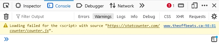
I did notice, though. that this...CODE
<script>
var sc_project=12839916;
var sc_invisible=0;
var sc_security="d7c72ec0";
var scJsHost = "https://";
document.write("<sc"+"ript type='text/javascript' src='" +
scJsHost+
"statcounter.com/counter/counter.js'></"+"script>");
</script>
<noscript><div class="statcounter"><a title="Web Analytics"
href="https://statcounter.com/" target="_blank"><img
class="statcounter"
src="https://c.statcounter.com/12839916/0/d7c72ec0/0/"
alt="Web Analytics"
referrerPolicy="no-referrer-when-downgrade"></a></div></noscript>
...appeared to be a problem.
There will probably be a similar reaction in other browsers.
coothead
Posted by: Lee Batchelor Feb 1 2024, 04:18 PM
Good catch Coothead.
I ran the the pages through the W3C Validator and they said it wasn't necessary to specify the Java script type. I don't know if you use this validator or find it unsuitable at times. I tried using the one on this site but it won't let me. Something about not having permission to use the "htaccess" file?
I ran the finished CSS file through the W3C, CSS validator and flagged an error with the margin definition.
p {
margin: 1em 2;
It didn't like the 2 not having a unit (px or em). I tried modifying it but it messes up the paragraphs. I like them they way they are. Thoughts?
EDIT
I just ran the CSS code through three different validators. They all found a million things wrong 🙄. It's so sad that in this hi-tech society, we can't all get on the same page 👿.
Posted by: coothead Feb 1 2024, 05:30 PM
I ran the the pages through the W3C Validator and they said it
wasn't necessary to specify the Java script type.
I don't know if you use this validator or find it unsuitable at times.
I use it regularly
p {
margin: 1em 2;
It didn't like the 2 not having a unit (px or em).
I tried modifying it but it messes up the paragraphs.
I like them they way they are. Thoughts?
I changed it toCODE
p {
margin: 0;
}
In the css file that I sent to you.
I just ran the CSS code through three different validators.
They all found a million things wrong 🙄.
It's so sad that in this hi-tech society, we can't all get on
the same page 👿.
I tested the css, as used here...
https://www.coothead.co.uk/theoffbeats/
...and it is identical to that which I sent to you.
You may see the result of the test here...
https://jigsaw.w3.org/css-validator/validator?profile=css3&warning=0&uri=https%3A%2F%2Fwww.coothead.co.uk%2Ftheoffbeats%2F
Don't worry to much, I will stay with you until your site is
rendered exactly as you desire.
Having said that, at almost eighty years of age it is quite
possible that I might shuffle off this mortal coil at any
moment. Luckily, if this should happen, I am certain that
other members here will finish the task in my stead.
coothead
Posted by: Lee Batchelor Feb 1 2024, 07:15 PM
Hi Coothead,
Many thanks for the validator information. When I trained in 2012, there were no mobile devices for websites, so we were only taught how to code for PC and Mac computers - much simpler days!
I'm delighted you use the W3C validator. I used it in training and for every website since. Never had any reported issues with the code not working on certain browsers.
I've learned SO much from reading through the code you wrote for me. The band members extend their gratitude as well. I'll be 71 in July, so I'm not that far behind you. All our band members are between 69 and 72.
I'll finalize the website and then upload it. As it stands, the pages all look fine at a breakpoint width of 340px. I modified some of the design concepts in your finished pages. I teach technical writing at Humber College in Toronto. In one of my courses, I teach the concepts put forth by Dr. Robin Williams (not the actor of course). She wrote a book entitled, The Non-Designers Design Book. In it, she coins the acronym, CRAP. It stands for Contrast, Repetition, Alignment, and Proximity. I use these rules exclusively in all my website and document designs for large companies. The goal is to drastically increase readability and information retrieval. Your designs follow these principles, with only a few minor differences.
Off topic - I have a friend who will hit the 80 mark this May. He's doing well and I'm sure we won't see you fall off the planet anytime soon either. At any rate, I'm eternally grateful for the help. Stay well...
- Lee
Powered by Invision Power Board (http://www.invisionboard.com)
© Invision Power Services (http://www.invisionpower.com)