
 Media Query help, Reducing image columns with a media query Media Query help, Reducing image columns with a media query |

| Binaary |
 Feb 3 2021, 09:59 AM Feb 3 2021, 09:59 AM
Post
#1
|
|
Group: Members Posts: 2 Joined: 3-February 21 Member No.: 27,766  |
After a few months of not touching html and having some spare time on my hands I've decided to improve my knowledge. I've started following a tutorial on making a gallery with different image heights, however trying to make it responsive is becoming a challenge.
This is the video that I've been following: https://www.youtube.com/watch?v=KI3h2RIMW2E HTML CODE <div class="container"> <div class="m-block"><img src="images/pic1.png"></div> <div class="m-block"><img src="images/pic2.png"></div> <div class="m-block"><img src="images/pic3.png"></div> <div class="m-block"><img src="images/pic4.png"></div> <div class="m-block"><img src="images/pic5.png"></div> <div class="m-block"><img src="images/pic6.png"></div> <div class="m-block"><img src="images/pic7.png"></div> <div class="m-block"><img src="images/pic9.png"></div> <div class="m-block"><img src="images/pic10.png"></div> <div class="m-block"><img src="images/pic3.png"></div> </div> CSS and @media CODE .container{ column-count:3; column-gap:10px; max-width:1800px; margin: 0 auto; padding-left: 10%; padding-right: 10%; } .m-block img{ width: 100%; cursor:pointer; padding: 10px; display:block; height:auto; box-sizing: border-box; } @media screen and (max-width: 1024px){ .container{ column-count: 3; } } @media screen and (max-width: 640px){ .container{ column-count: 2; } } @media screen and (max-width: 375px){ .container{ column-count:3; } } Full width  Mobile 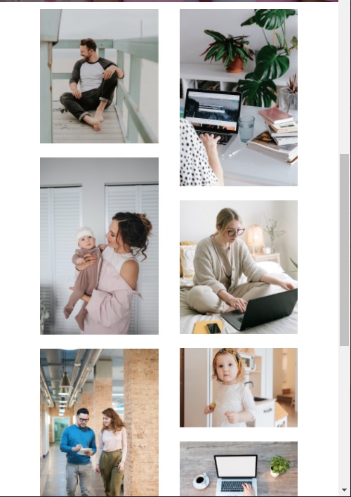 Any help as to why this isn't working would be greatly appreciated! |
  |

 
|
Posts in this topic
 Binaary Media Query help Feb 3 2021, 09:59 AM
 pandy In what way does it go wrong? The screen caps show... Feb 3 2021, 02:37 PM Binaary Sorry just noticed the above code is slightly wron... Feb 4 2021, 07:53 AM
 pandy I'm not good at media queries, but AFAIK see y... Feb 4 2021, 07:59 AM Christian J "max-width: 375px" is not much on a mode... Feb 4 2021, 10:37 AM pandy No. I have a budget phone and its resolution is 10... Feb 4 2021, 03:47 PM Christian J The OP posted a correction in Post #3. Feb 4 2021, 04:34 PM pandy Oh! I never saw it. He must have posted while ... Feb 4 2021, 04:39 PM pandy Isn't there a better way to do this? I've ... Feb 5 2021, 07:53 AM Christian J
Isn't there a better way to do this? I've... Feb 5 2021, 11:53 AM
pandy I'm not good at media queries, but AFAIK see y... Feb 4 2021, 07:59 AM Christian J "max-width: 375px" is not much on a mode... Feb 4 2021, 10:37 AM pandy No. I have a budget phone and its resolution is 10... Feb 4 2021, 03:47 PM Christian J The OP posted a correction in Post #3. Feb 4 2021, 04:34 PM pandy Oh! I never saw it. He must have posted while ... Feb 4 2021, 04:39 PM pandy Isn't there a better way to do this? I've ... Feb 5 2021, 07:53 AM Christian J
Isn't there a better way to do this? I've... Feb 5 2021, 11:53 AM  |
1 User(s) are reading this topic (1 Guests and 0 Anonymous Users)
0 Members:

|
Lo-Fi Version | Time is now: 7th June 2024 - 11:33 AM |
Invision Power Board
© 2024 IPS, Inc.
Licensed to: HTMLHelp.com, LLC