
 Need help arranging sections in HTML / CSS Need help arranging sections in HTML / CSS |
  |

| JUI43555 |
 Mar 6 2023, 01:11 AM Mar 6 2023, 01:11 AM
Post
#1
|
|
Member  Group: Members Posts: 44 Joined: 6-March 23 From: Perth Member No.: 28,833  |
Hi all, very new to HTML & CSS and hoping someone can point in the right direction of how to go about coding like this. My task is to get it exact (apart from color)
I need it to have no DIVS which I'm struggling with. I don't even know where to start. Is there a similar HTML template like the example below that i can study? Thanks and help or advise is appreciated. JUI 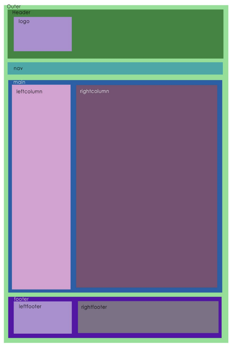 |
  |

 
|
| pandy |
Mar 6 2023, 01:46 AM
Post
#2
|
|
🌟Computer says no🌟 Group: WDG Moderators Posts: 20,733 Joined: 9-August 06 Member No.: 6 |
Why can't you use DIV? Are your options limited in other ways?
|
|
|
|
| JUI43555 |
Mar 6 2023, 01:48 AM
Post
#3
|
|
Member Group: Members Posts: 44 Joined: 6-March 23 From: Perth Member No.: 28,833 |
QUOTE(pandy @ Mar 6 2023, 02:46 PM)  Why can't you use DIV? Are you options limited in other ways? Apologies, i must use semantic HTML. |
|
|
|
| Christian J |
Mar 6 2023, 01:59 PM
Post
#4
|
|
. Group: WDG Moderators Posts: 9,661 Joined: 10-August 06 Member No.: 7 |
Hi!
QUOTE(JUI43555 @ Mar 6 2023, 07:11 AM) I need it to have no DIVS which I'm struggling with. I don't even know where to start. I'd start with the HTML structure: - Outer might be the BODY element. - Header, Nav and Footer could be the HTML elements using the same names. - Main might be a SECTION, or perhaps ARTICLE (or ASIDE?) element, depending on the semantics of the (text) content. See https://html.spec.whatwg.org/multipage/indi...#index-elements (follow the links in the left column for details on each HTML element above). To style the above like in the image, you might use CSS margins around the elements to give them space. There are several ways to create the columns with CSS, which one to use may depend on how you want the layout to adapt to narrow browser windows (like mobile phones in portrait orientation); and also depending on what should happen if the content is wider than the relatively narrow left columns. |
|
|
|
| coothead |
Mar 6 2023, 02:13 PM
Post
#5
|
|
Advanced Member Group: Members Posts: 206 Joined: 12-January 23 From: chertsey, a small town 25 miles south west of london, england Member No.: 28,743 |
Hi there JUI43555,
here is one possible solution... HTML CODE <!DOCTYPE HTML> <html lang="en"> <head> <meta charset="utf-8"> <meta name="viewport" content="width=device-width,height=device-height,initial-scale=1"> <title>This is the page description</title> <link rel="stylesheet" href="screen.css" media="screen"> </head> <body> <header> <h1> Appropriate description. </h1> </header> <nav> <ul> <li> <a href="#">link 1</a> </li> <li> <a href="#">link 2</a> </li> <li> <a href="#">link 3</a> </li> <li> <a href="#">link 4</a> </li> </ul> </nav> <main> <section> <h2> lorem ipsum </h2> <p> Lorem ipsum dolor sit amet, consectetur adipiscing elit, sed do eiusmod tempor incididunt ut labore et dolore magna aliqua. Et tortor at risus viverra adipiscing at. Sagittis eu volutpat odio facilisis mauris sit amet. Hendrerit gravida rutrum quisque non tellus orci ac auctor. Et tortor at risus viverra adipiscing. </p> </section> <section> <h2> info here </h2> <p> Quis imperdiet massa tincidunt nunc pulvinar sapien. Justo laoreet sit amet cursus. Suspendisse faucibus interdum posuere lorem ipsum dolor sit amet consectetur. Id semper risus in hendrerit gravida rutrum. Vulputate odio ut enim blandit volutpat maecenas. Et leo duis ut diam quam nulla porttitor massa id. </p> </section> </main> <footer> <p> © 2013 JUI43555 </p> <p> footer info here. </p> </footer> </body> </html> screen.css CODE * { margin: 0; box-sizing: border-box; } body { margin: 0.5em; background-color: #ccc; font: normal 1em / 1.6em sans-serif; } header, nav, main, footer { background-color: #fff; } header { display: flex; align-items: center; min-height: 11em; margin-bottom: 0.5em; padding: 1em 1em 1em 17em; border: 1px solid #000; background-image: url(https://via.placeholder.com/240x144/000/fff?text=logo); background-size: 15em 9em; background-position: 1em 1em; background-repeat: no-repeat; } header h1 { font-size: 1.25em; } nav { padding: 1em; margin-bottom: 0.5em; border: 1px solid #000; } nav ul { display: flex; flex-direction: row; flex-wrap: wrap; justify-content: center; gap: 0.5em; padding: 0; list-style: none; } nav ul a { display: block; padding: 0.25em 0.5em; color: #000; } main { display: flex; flex-direction: row;; gap: 1em; padding: 1em; margin-bottom: 0.5em; border: 1px solid #000; } main section { padding: 1em; } main section h2 { font-size: 1.25em; } main section:first-of-type{ width: 30%; border: 1px solid #000; } main section:last-of-type{ width: 70%; border: 1px solid #000; } footer { display: flex; flex-direction: row;; gap: 1em; padding: 1em; border: 1px solid #000; } footer p { padding: 1em; } footer p:first-of-type{ width: 30%; border: 1px solid #000; } footer p:last-of-type{ width: 70%; border: 1px solid #000; } @media ( max-width: 38em) { main { flex-direction: column; } main section:first-of-type, main section:last-of-type, footer p:first-of-type, footer p:last-of-type{ width: 100%; } header { min-height: 8em; padding: 1em 1em 1em 12em; background-size: 10em 6em; } } @media ( max-width: 31em) { header { min-height: 8em; padding: 1em 1em 1em 12em; background-size: 10em 6em; } } @media ( max-width: 21em) { header { min-height: 6.5em; padding: 1em 1em 1em 9.5em; background-size: 7.5em 4.5em; } } You may view the result here... Full Page View https://codepen.io/coothead/full/vYzJexV coothead |
|
|
|
| JUI43555 |
Mar 7 2023, 03:27 AM
Post
#6
|
|
Member Group: Members Posts: 44 Joined: 6-March 23 From: Perth Member No.: 28,833 |
QUOTE(coothead @ Mar 7 2023, 03:13 AM) Hi there JUI43555, here is one possible solution... HTML CODE <!DOCTYPE HTML> <html lang="en"> <head> <meta charset="utf-8"> <meta name="viewport" content="width=device-width,height=device-height,initial-scale=1"> <title>This is the page description</title> <link rel="stylesheet" href="screen.css" media="screen"> </head> <body> <header> <h1> Appropriate description. </h1> </header> <nav> <ul> <li> <a href="#">link 1</a> </li> <li> <a href="#">link 2</a> </li> <li> <a href="#">link 3</a> </li> <li> <a href="#">link 4</a> </li> </ul> </nav> <main> <section> <h2> lorem ipsum </h2> <p> Lorem ipsum dolor sit amet, consectetur adipiscing elit, sed do eiusmod tempor incididunt ut labore et dolore magna aliqua. Et tortor at risus viverra adipiscing at. Sagittis eu volutpat odio facilisis mauris sit amet. Hendrerit gravida rutrum quisque non tellus orci ac auctor. Et tortor at risus viverra adipiscing. </p> </section> <section> <h2> info here </h2> <p> Quis imperdiet massa tincidunt nunc pulvinar sapien. Justo laoreet sit amet cursus. Suspendisse faucibus interdum posuere lorem ipsum dolor sit amet consectetur. Id semper risus in hendrerit gravida rutrum. Vulputate odio ut enim blandit volutpat maecenas. Et leo duis ut diam quam nulla porttitor massa id. </p> </section> </main> <footer> <p> © 2013 JUI43555 </p> <p> footer info here. </p> </footer> </body> </html> screen.css CODE * { margin: 0; box-sizing: border-box; } body { margin: 0.5em; background-color: #ccc; font: normal 1em / 1.6em sans-serif; } header, nav, main, footer { background-color: #fff; } header { display: flex; align-items: center; min-height: 11em; margin-bottom: 0.5em; padding: 1em 1em 1em 17em; border: 1px solid #000; background-image: url(https://via.placeholder.com/240x144/000/fff?text=logo); background-size: 15em 9em; background-position: 1em 1em; background-repeat: no-repeat; } header h1 { font-size: 1.25em; } nav { padding: 1em; margin-bottom: 0.5em; border: 1px solid #000; } nav ul { display: flex; flex-direction: row; flex-wrap: wrap; justify-content: center; gap: 0.5em; padding: 0; list-style: none; } nav ul a { display: block; padding: 0.25em 0.5em; color: #000; } main { display: flex; flex-direction: row;; gap: 1em; padding: 1em; margin-bottom: 0.5em; border: 1px solid #000; } main section { padding: 1em; } main section h2 { font-size: 1.25em; } main section:first-of-type{ width: 30%; border: 1px solid #000; } main section:last-of-type{ width: 70%; border: 1px solid #000; } footer { display: flex; flex-direction: row;; gap: 1em; padding: 1em; border: 1px solid #000; } footer p { padding: 1em; } footer p:first-of-type{ width: 30%; border: 1px solid #000; } footer p:last-of-type{ width: 70%; border: 1px solid #000; } @media ( max-width: 38em) { main { flex-direction: column; } main section:first-of-type, main section:last-of-type, footer p:first-of-type, footer p:last-of-type{ width: 100%; } header { min-height: 8em; padding: 1em 1em 1em 12em; background-size: 10em 6em; } } @media ( max-width: 31em) { header { min-height: 8em; padding: 1em 1em 1em 12em; background-size: 10em 6em; } } @media ( max-width: 21em) { header { min-height: 6.5em; padding: 1em 1em 1em 9.5em; background-size: 7.5em 4.5em; } } You may view the result here... Full Page View https://codepen.io/coothead/full/vYzJexV coothead This is incredibly helpful thank you so much |
|
|
|
|
2 User(s) are reading this topic (2 Guests and 0 Anonymous Users)
0 Members:

|
Lo-Fi Version | Time is now: 27th April 2024 - 04:24 PM |
Invision Power Board
© 2024 IPS, Inc.
Licensed to: HTMLHelp.com, LLC