
 How to make a Nav bar sticky How to make a Nav bar sticky |
  |

| JUI43555 |
 May 16 2023, 10:11 PM May 16 2023, 10:11 PM
Post
#1
|
|
Member  Group: Members Posts: 44 Joined: 6-March 23 From: Perth Member No.: 28,833  |
Hi I need the nav bar links (Products/ About / Contact / Search icon / Cart icon) to remain stuck in the same position when scrolling down.
Id prefer the logo to be separate from this. and only the list above to be sticky. I think it's the flex style which is not allowing me to use position:sticky. Ive linked the images on imgur and provided a screenshot of what it should look like. (i was unable to add the images as per recent instructions, maybe the bug) Sorry in advance if I've posted this incorrectly. 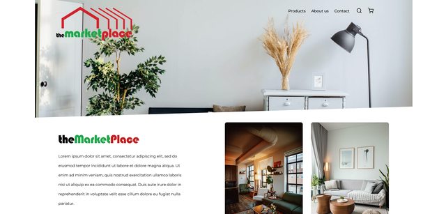 CODE <!DOCTYPE html> <html lang="en"> <head> <meta charset="UTF-8" /> <meta http-equiv="X-UA-Compatible" content="IE=edge" /> <meta name="viewport" content="width=device-width, initial-scale=1.0" /> <link rel="preconnect" href="https://fonts.googleapis.com" /> <link rel="preconnect" href="https://fonts.gstatic.com" crossorigin /> <link rel="preconnect" href="https://fonts.googleapis.com" /> <link rel="preconnect" href="https://fonts.gstatic.com" crossorigin /> <link rel="preconnect" href="https://fonts.googleapis.com" /> <link rel="preconnect" href="https://fonts.gstatic.com" crossorigin /> <link href="https://fonts.googleapis.com/css2?family=Montserrat:wght@400;500;700&display=swap" rel="stylesheet" /> <link rel="stylesheet" href="css/style.css" /> <title>The MarketPlace | Home</title> </head> <body> <div class="main-container"> <header class="header"> <img src="<a href="https://imgur.com/aJAXiPG"><img src="https://i.imgur.com/aJAXiPGl.png" title="source: imgur.com" /></a>" alt="The Market Place Logo" class="logo" /> <nav> <ul class="nav__links"> <li><a href="#">Products</a></li> <li><a href="#">About us</a></li> <li><a href="#">Contact</a></li> <li> <a href="#"><a href="https://imgur.com/tKpEHBi"><img src="https://i.imgur.com/tKpEHBil.png" title="source: imgur.com" /></a> </a> </li> <li> <a href="#"><a href="https://imgur.com/tKpEHBi"><img src="https://i.imgur.com/tKpEHBil.png" title="source: imgur.com" /></a></a> </li> </ul> </nav> </header> <section class="cta-section-container"> <div class="cta-content"> <img src="images/logo_theMarketPlaceTEXT.svg" alt="" class="mp-text" /> <p> <span class="cta-text"> Lorem ipsum dolor sit amet, consectetur adipiscing elit, sed do eiusmod tempor incididunt ut labore et dolore magna aliqua. Ut enim ad minim veniam, quis nostrud exercitation ullamco laboris nisi ut aliquip ex ea commodo consequat. Duis aute irure dolor in reprehenderit in voluptate velit esse cillum dolore eu fugiat nulla pariatur. </span> </p> <a href="#" type="button">Click Here</a> </div> <div class="image-container"> <img src="images/home_dark.jpg" alt="a living room filled with furniture and a large window" class="image-dark" /> <img src="images/home_light.jpg" alt="a living room filled with furniture and a large window" class="image-light" /> </div> </section> <div class="featured-titles"> <h2>Featured items</h2> <p>Hundreds of new products - Proud Australian</p> </div> <div class="card-container"> <div class="product-cards"> <div class="card"> <img src="images/product_washingmachine_white.png" alt="" class="prod-img" /> <p class="fi-title-headings">8kg EasyCare front load washer</p> <p>$69.00 <span>$715.00</span></p> <img src="images/stars.png" alt="" class="stars" /> </div> <div class="card"> <img src="images/product_washingmachine_grey.png" alt="" class="prod-img" /> <p class="fi-title-headings">8kg Darth Vaders dish washer</p> <p>$420.00 <span>$550.00</span></p> <img src="images/stars.png" alt="" class="stars" /> </div> <div class="card"> <img src="images/product_lawnmower.png" alt="" class="prod-img" /> <p class="fi-title-headings">9728hp Man-mower lawny thing</p> <p>$416.00 <span>$750.00</span></p> <img src="images/stars.png" alt="" class="stars" /> </div> </div> </div> <section class="featured-items-cta"> <div class="fi-cta-container"> <div class="fi-content"> <h2>Featured Items</h2> <p>Lorem ipsum dolor, sit amet consectetur adipisicing elit. Obcaecati nostrum pariatur a dolorem, id temporibus fugiat sapiente rem quibusdam quos.</p> <a href="#" type="button">Click here</a> </div> </div> </section> <section class="brands"> <img src="images/brand_Samsung Electronics - jpeg.jpg" alt="link to Samsung.com" /> <img src="images/brand_dyson_logo.jpg" alt="logo" /> <img src="images/brand_RYOBI_Logo_1_.png" alt="logo" /> <img src="images/brand_Ozito DIY - png 0.png" alt="logo" /> </section> <footer class="footer"> <div class="grid-container"> <div class="footer-box footer-1"> <img src="images/theMarketPlacefooter.png" alt="the MarketPlace" class="footer-logo" /> <p>Lorem ipsum dolor sit amet consectetur, adipisicing elit. Numquam, eligendi?</p> <p class="footer_signoff">© 2023 theMarketPlace | Ben Roberts</p> </div> <div class="footer-box footer-2"> <h2>Helpful links</h2> <a href="#">Catalogue</a> <a href="#">About Us</a> <a href="#">Contact us</a> <a href="#">Home</a> </div> <div class="footer-box footer-3"> <h2>Information</h2> <a href="#">Community</a> <a href="#">T&Cs</a> <a href="#">Privacy Policy</a> <a href="#">Events</a> </div> <div class="footer-box footer-4"> <a href=""><img src="images/icon_Facebook - Negative.png" alt="Facebook" /></a> <a href=""><img src="images/icon_Twitter - Negative.png" alt="Twitter" /></a> <a href=""><img src="images/icon_Instagram - Negative.png" alt="Instagram" /></a> <a href=""><img src="images/icon_YouTube - Negative.png" alt="Youtube" /></a> </div> </div> </footer> <!-- <footer> <div class="footer-container"> <div class="footer"> <div class="footer-heading footer-1"> <img src="images/theMarketPlacefooter.png" alt="the MarketPlace" class="footer-logo" /> <p>Lorem ipsum dolor sit amet consectetur, adipisicing elit. Numquam, eligendi?</p> <p class="footer_signoff">© 2023 theMarketPlace</p> </div> <div class="footer-heading footer-2"> <h2>Helpful links</h2> <a href="#">Catalogue</a> <a href="#">About Us</a> <a href="#">Contact us</a> <a href="#">Home</a> </div> <div class="footer-heading footer-3"> <h2>Information</h2> <a href="#">Community</a> <a href="#">Terms & Conditions</a> <a href="#">Privacy Policy</a> <a href="#">Events</a> </div> <div class="footer-4"> <a href=""><img src="images/icon_Facebook - Negative.png" alt="Facebook" /></a> <a href=""><img src="images/icon_Twitter - Negative.png" alt="Twitter" /></a> <a href=""><img src="images/icon_Instagram - Negative.png" alt="Instagram" /></a> <a href=""><img src="images/icon_YouTube - Negative.png" alt="Youtube" /></a> </div> </div> </div> </footer> --> </div> </body> </html> CODE :root { /* primary */ --dark-grey-background: #909090; --red-cta-button: #a60000; --paragraph-light-grey: #c6b8b8; /* neutral */ --white: #fff; --black: #000; } @font-face { font-family: Blippo; src: url(/fonts/Blippo\ Black\ Regular.otf); } * { padding: 0; margin: 0; box-sizing: border-box; font-family: "Montserrat", sans-serif; } body { max-width: 1600px; margin: 0 auto; } .main-container { width: 100%; } .header { width: 100%; height: 500px; background-image: url(<a href="https://imgur.com/BINVeAR"><img src="https://i.imgur.com/BINVeARl.png" title="source: imgur.com" /></a>); background-repeat: no-repeat; background-size: fill; background-position: cover; overflow: hidden; display: flex; justify-content: space-between; align-items: start; padding: 30px 10% 30px 90px; } .logo { width: 322px; cursor: pointer; } .nav__links { list-style: none; } .nav__links li { display: inline-block; padding: 0px 10px; } .nav__links li a { font-weight: 500; text-decoration: none; color: var(--black); transition: all 0.3s ease 0s; } .nav__links li a:hover { color: var(--dark-grey-background); } .nav__links li img { position: relative; /* Adjust these values accordingly */ top: 5px; left: 5px; } .cta-section-container { display: flex; flex-direction: row; justify-content: space-between; margin: 0 auto; margin: 20px 100px; } .cta-content { margin: auto auto; /* width: 429px; height: 444px; */ } .cta-content p { line-height: 40px; padding: 30px 0px 10px 0px; margin-bottom: 50px; font-size: 16px; width: 75%; } .cta-content a { font-weight: 700; background-color: var(--red-cta-button); padding: 16px 67px; color: var(--white); border-radius: 8px; text-decoration: none; text-align: center; } .image-container { display: flex; gap: 35px; } .image-container img { border-radius: 8px; width: 330px; } .image-dark:hover { background-image: url(/images/home_light.jpg); cursor: pointer; } /* .featured-items { background-color: rgb(126, 176, 219); } */ .featured-titles { text-align: center; margin: 70px 0px 34px 0px; } .featured-titles h2 { padding: 5px; font-family: Blippo; font-size: 48px; } .featured-titles p { color: var(--paragraph-light-grey); font-size: 20px; } .card-container { margin-bottom: 65px; } .product-cards { gap: 50px; margin: auto 20px; display: flex; flex-direction: row; justify-content: center; align-items: center; } .prod-img { margin-bottom: 22px; box-shadow: 0px 4px 4px rgba(0, 0, 0, 0.25); } .product-cards p { text-align: center; } .fi-title-headings { margin-bottom: 20px; } .stars { display: block; margin: 22px auto 0px auto; } .card-container span { color: var(--paragraph-light-grey); text-decoration: line-through; padding-left: 5px; } /* Featured items CTA box women gardening */ .featured-items-cta { width: 1180px; padding: 50px 0; margin: 10px auto; align-self: center; background-image: url(/images/featured-item-background-garden.png); background-repeat: no-repeat; } .fi-cta-container { background-color: rgba(245, 245, 245, 0.7); width: 570px; margin-left: 100px; border-radius: 8px; } .fi-content { padding: 36px; } .fi-content h2 { font-family: Blippo; font-size: 45px; margin-bottom: 15px; } .fi-content p { line-height: 36px; margin-bottom: 30px; } .fi-content a { font-weight: 700; background-color: var(--red-cta-button); padding: 16px 67px; color: var(--white); border-radius: 8px; text-decoration: none; } .brands { display: flex; flex-direction: row; justify-content: space-around; align-items: center; margin: 10px 100px 30px 100px; } .brands img { width: auto; } .grid-container { height: 40vh; background-color: #909090; display: grid; grid-template-rows: 350px; /* grid-template-columns: repeat(4, 270px); */ grid-template-columns: 350px 270px 270px 350px; justify-content: center; align-items: center; } .footer-box { padding: 20px; } .footer-1 img { width: 225px; margin-bottom: 10px; display: inline-block; } .footer-1 p { line-height: 1.8rem; margin-bottom: 20px; } .footer-2 { display: flex; flex-direction: column; margin-left: 50px; } .footer-2 h2 { margin-bottom: 10px; } .footer-2 a { text-decoration: none; color: black; margin-top: 10px; } .footer-3 { display: flex; flex-direction: column; margin-left: 50px; } .footer-3 h2 { margin-bottom: 10px; } .footer-3 a { text-decoration: none; color: black; margin-top: 10px; } .footer-4 img { padding: 10px; } /* .footer-container { background-color: var(--dark-grey-background); } .footer { width: 80%; height: 370px; display: flex; justify-content: space-between; align-items: center; margin: 0 auto; } .footer ul { text-decoration: none; } .footer-logo { max-width: 250px; } .footer-heading { display: flex; flex-basis: 25%; flex-direction: column; } .footer-heading h2 { margin-bottom: 0.5rem; font-size: 18px; } .footer-heading a { text-decoration: none; color: var(--black); margin-top: 10px; } .footer-heading a:hover { color: var(--paragraph-light-grey); } .footer-1 img { margin: 20px; } .footer-1 p { margin: 20px; } .footer-2 { text-align: center; } */ /* Mobile */ @media (max-width: 485px) { .header { flex-direction: column; justify-content: space-around; align-items: center; } .logo { margin-top: 20px; } .nav__links { display: flex; flex-direction: column; align-items: center; background-color: rgba(245, 245, 245, 0.8); border-radius: 10px; } .nav__links li { margin: 10px 0; } .cta-section-container { flex-direction: column; align-items: center; margin-bottom: 10px; } .mp-text { width: 250px; } .cta-content { text-align: center; margin-bottom: 30px; } .cta-content p { font-size: 14px; width: 100%; } .cta-content a { padding: 12px 50px; font-size: 14px; } .image-container { flex-direction: column; } .image-container img { width: 100%; height: auto; margin-bottom: 20px; } .card-container { margin-bottom: 30px; } .product-cards { flex-direction: column; align-items: center; } .prod-img { margin-bottom: 15px; } .product-cards p { font-size: 14px; } .fi-title-headings { margin-bottom: 15px; } .stars { margin: 15px auto 0 auto; } .featured-items-cta { width: 100%; margin: 30px 0; background-size: cover; } .fi-cta-container { width: 100%; margin: 0; border-radius: 0; } .fi-content { padding: 20px; } .fi-content h2 { font-size: 30px; } .fi-content p { line-height: 24px; margin-bottom: 20px; font-size: 14px; } .fi-content a { padding: 12px 50px; font-size: 14px; } .brands { flex-wrap: wrap; justify-content: center; margin: 30px 0; } .brands img { width: 40%; max-width: 200px; margin-bottom: 20px; } .grid-container { display: flex; flex-direction: column; text-align: center; height: 100vh; } .footer-2 { margin-left: 0px; } .footer-3 { margin-left: 0px; } } |
  |

 
|
| pandy |
May 16 2023, 10:28 PM
Post
#2
|
|
🌟Computer says no🌟 Group: WDG Moderators Posts: 20,733 Joined: 9-August 06 Member No.: 6 |
Read up about position: fixed. That's what you need for nav. Also, you should run what you have now through a validator first. Or rather two. Both the HTML and CSS need some fixing.
|
|
|
|
| JUI43555 |
May 16 2023, 10:32 PM
Post
#3
|
|
Member Group: Members Posts: 44 Joined: 6-March 23 From: Perth Member No.: 28,833 |
QUOTE(pandy @ May 17 2023, 11:28 AM)  Read up about position: fixed. That's what you need for nav. Also, you should run what you have now through a validator first. Or rather two. Both the HTML and CSS need some fixing. Thanks i should of prefaced that this is in no way finished and is just the first draft. I' aware there is a lot of fixing to do. Just trying to get the overall layout correct then i can clean it up. I already researched Position: fixed and i think the reason that inst working is because of the flex properties the nav bar has. position: fixed seems to stacks all the <li> content on top of each other. |
|
|
|
| JUI43555 |
May 16 2023, 10:38 PM
Post
#4
|
|
Member Group: Members Posts: 44 Joined: 6-March 23 From: Perth Member No.: 28,833 |
So I ran the HTML & CSS through W3 validator and the only errors were
HTML - Trailing slashes (caused by auto format in VS code) CSS - header fill not needed & background position incorrect which i can fix. Was there anything else that was wrong that you were referring to that I could fix? |
|
|
|
| pandy |
May 16 2023, 11:08 PM
Post
#5
|
|
🌟Computer says no🌟 Group: WDG Moderators Posts: 20,733 Joined: 9-August 06 Member No.: 6 |
What validators? Surely not the W3C ones?
I get this for your CSS. CODE 35 .header Value Error : background-image Parse Error url(<a href="https://imgur.com/BINVeAR"><img src="https://i.imgur.com/BINVeARl.png" title="source: imgur.com" /></a>) 37 .header fill is not a background-size value : fill 38 .header Value Error : background-position Too many values or values are not recognized : cover I didn't read all of it. I just happened to see that you've put a HTML link in your CSS (the first error above). Probably nothing of the style sheet is read after that point. Likewise you have at least one broken HTML tag with attributes spread all over the place. Yes, I see your nav sort of collapses. Seems to be fixed by adding some offset though. I tested with just this. nav { position: fixed; left: 70% } I'm not sure why this happens, so there may be other solutions as well. |
|
|
|
| JUI43555 |
May 16 2023, 11:11 PM
Post
#6
|
|
Member Group: Members Posts: 44 Joined: 6-March 23 From: Perth Member No.: 28,833 |
QUOTE(pandy @ May 17 2023, 12:08 PM) What validators? Surely not the W3C ones? I get this for your CSS. CODE 35 .header Value Error : background-image Parse Error url(<a href="https://imgur.com/BINVeAR"><img src="https://i.imgur.com/BINVeARl.png" title="source: imgur.com" /></a>) 37 .header fill is not a background-size value : fill 38 .header Value Error : background-position Too many values or values are not recognized : cover I didn't read all of it. I just happened to see that you've put a HTML link in your CSS (the first error above). Probably nothing of the style sheet is read after that point. Likewise you have at least one broken HTML tag with attributes spread all over the place. Yes, I see your nav sort of collapses. Seems to be fixed by adding some offset though. I tested with just this. nav { position: fixed; left: 70% } I'm not sure why this happens, so there may be other solutions as well. Thanks for the reply i'll take a look. That's my bad on the html link, i only put that link in from the imgur images i saved so they would show but must have put in the wrong link |
|
|
|
| JUI43555 |
May 16 2023, 11:12 PM
Post
#7
|
|
Member Group: Members Posts: 44 Joined: 6-March 23 From: Perth Member No.: 28,833 |
nav { position: fixed; left: 70% }.
This worked! Thank you! |
|
|
|
| Christian J |
May 17 2023, 07:19 AM
Post
#8
|
|
. Group: WDG Moderators Posts: 9,661 Joined: 10-August 06 Member No.: 7 |
The black menu links with their transparent backgrounds could possibly become unreadable in front of darker page areas (like "images/home_dark.jpg"?) when the user scrolls down.
|
|
|
|
| pandy |
May 17 2023, 08:52 AM
Post
#9
|
|
🌟Computer says no🌟 Group: WDG Moderators Posts: 20,733 Joined: 9-August 06 Member No.: 6 |
QUOTE(JUI43555 @ May 17 2023, 05:38 AM) So I ran the HTML & CSS through W3 validator and the only errors were HTML - Trailing slashes (caused by auto format in VS code) CSS - header fill not needed & background position incorrect which i can fix. Was there anything else that was wrong that you were referring to that I could fix? Then what you fed the validators wasn't the same as what you posted here. For instance, the first CSS error in the validator result I posted above is because of this. CODE background-image: url(<a href="https://imgur.com/BINVeAR"><img src="https://i.imgur.com/BINVeARl.png" title="source: imgur.com" /></a>); You have two HTML tags in the CSS. That error is so bad the rest of the CSS won't be read. And you certainly won't have any background image. One example from the HTML. CODE <img src="<a href="https://imgur.com/aJAXiPG"><img src="https://i.imgur.com/aJAXiPGl.png" title="source: imgur.com" /></a>" alt="The Market Place Logo" class="logo" /> Here you've written the A tag inside a broken IMG tag and some attributes that belongs to the IMG tags (at least one of them does for certain) are written outside any tag at all. |
|
|
|
|
2 User(s) are reading this topic (2 Guests and 0 Anonymous Users)
0 Members:

|
Lo-Fi Version | Time is now: 27th April 2024 - 09:36 AM |
Invision Power Board
© 2024 IPS, Inc.
Licensed to: HTMLHelp.com, LLC