
 Who needs images, I have CSS. Who needs images, I have CSS. |

| Jason Knight |
 Jan 7 2023, 01:19 PM Jan 7 2023, 01:19 PM
Post
#1
|
|
Advanced Member  Group: Members Posts: 103 Joined: 25-December 22 Member No.: 28,719  |
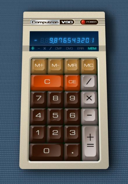
Just thought I'd share my most recent Medium article series on building a calculator with HTML and CSS. I came across someone doing it on Twitter and thought I could do better... then I decided to do it different as well.
Part 1: https://medium.com/codex/how-css-is-reducin...tor-ccf9332e56e part 2: https://medium.com/codex/how-css-is-reducin...dy-bd5ee628e849 Part 3 is a WIP, I'll post when I put it up. For part 3 for those of you past the read limit, the project directory is here: https://cutcodedown.com/for_others/medium_a...es/htmlCSSCalc/ The calc.html in there is a live demo, there's a .rar of the whole project, and the directory is unlocked for easy access to the gooey bits and pieces. It's fun that:  Can be done in nothing but HTML and CSS. The only image file that's used is the canvas background, and even that's a greyscale alpha transparency so colours can be set from the CSS. This post has been edited by Jason Knight: Jan 7 2023, 01:20 PM |
  |

 
|
  |
Replies
| coothead |
Jan 21 2023, 11:21 AM
Post
#2
|
|
Advanced Member Group: Members Posts: 206 Joined: 12-January 23 From: chertsey, a small town 25 miles south west of london, england Member No.: 28,743 |
QUOTE(Jason Knight) . Can be done in nothing but HTML and CSS. . The only image file that's used is the canvas background, . and even that's a greyscale alpha transparency so colours . can be set from the CSS.
coothead This post has been edited by coothead: Jan 21 2023, 12:10 PM |
|
|
|

Posts in this topic
 Jason Knight Who needs images, I have CSS. Jan 7 2023, 01:19 PM
 Christian J Cool! That reminds me of some old CSS experime... Jan 14 2023, 08:29 PM
|
2 User(s) are reading this topic (2 Guests and 0 Anonymous Users)
0 Members:

|
Lo-Fi Version | Time is now: 26th April 2024 - 02:27 AM |
Invision Power Board
© 2024 IPS, Inc.
Licensed to: HTMLHelp.com, LLC